

14-Day Money-Back Guarantee
0
The short answer
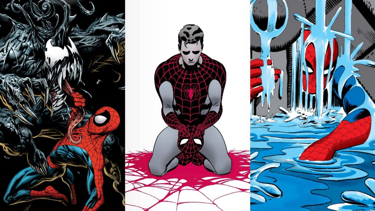
A cover becomes iconic when it captures a moment rather than a pose: Peter throwing his costume in the bin, webbing swallowing the whole page, the black, imageless background from the aftermath of 9/11. Twelve Spider-Man covers have left their mark on the history of the medium — and the first one wasn’t even drawn by his creator.
In this article
You don’t collect issues, you collect images. And across sixty years of publication, a handful of covers have stopped being illustrations and become icons — reproduced as posters, on t-shirts, and in homages by other artists.
Here they are, why they mattered, and what they say about the era that produced them.
What makes a cover iconic
Three mechanisms come up on every cover in this list, and none of them has anything to do with how pretty the artwork is.
The moment
An iconic cover shows a turning point: a surrender, a death, a first appearance. A heroic pose, however well executed, tells no story.
The break
It breaks a convention. A black background with no character, a hero seen from behind, a costume that changes colour: what surprises the reader at the newsstand sticks in the memory.
The artist’s hand
An artist leaves a recognisable signature on it — Ditko’s nervy line, McFarlane’s obsessive webbing. You know who drew it before you read the credit.
Most of the covers below tick all three boxes. That’s what sets them apart from the thousands of others, technically flawless and completely forgotten.
1962: Amazing Fantasy 15, the first
The most expensive cover in the character’s history, and the most paradoxical: it isn’t by Steve Ditko.
The Kirby paradox
Ditko created the costume, drew every interior page and submitted a cover. Stan Lee rejected it at the last minute and handed the job to Jack Kirby, the company’s star artist — Ditko only did the inking.
The result: the very first public image of Spider-Man bears Kirby’s heavy line, the opposite of the angular style that would define the character from the very next page. The story of that graphic rivalry is told in our portrait of Steve Ditko, the visual architect.
What the cover shows
Spider-Man mid-swing, a man tucked under his arm, above a stylised city. No threat, no opponent: just movement. It’s the promise of a hero who moves unlike any other, and it’s exactly the promise the character would keep.
1967: Spider-Man No More
Amazing Spider-Man #50, July 1967, by John Romita Sr. Probably the most imitated cover in the whole series.
Peter Parker walks away from us in the rain, in his jacket, while the costume lies in a dustbin in the foreground. No fight, no villain. A man giving up.
It was the first time a superhero cover showed the hero quitting, and it set a motif the films would lift wholesale decades later. Romita, who had arrived a year earlier to replace Ditko, stamps his vision of the character on it — see how Romita fixed the face of Spider-Man.
Why it endures across the eras
Because it tells the one thing the character has never stopped wanting to do: stop. Every time a writer returns to that idea, this is the image they quote.

Retro Spider-Man Poster
The look of 1960s covers, as a poster. Find it among our posters.
View the product — €16.901973: the death of Gwen Stacy
Amazing Spider-Man #121 and #122, June and July 1973. Two linked covers, for the event that brought the Silver Age of comics to an end.
The first shows the faces of everyone close to Peter, with the question of which one is going to die. The second, the Green Goblin and Spider-Man face to face, without her. Gwen’s absence from the cover of #122 says it all.
It’s the arc we analyse in the death of Gwen Stacy, the arc that changed everything, and the starting point of the rivalry with Norman Osborn detailed in our portrait of the Green Goblin.
The detail readers at the time never saw coming
The cover of #121 poses a multiple-choice question. Nobody imagined the answer would be the hero’s girlfriend. Comics didn’t kill that kind of character.
1984-1988: black, then Venom
Two covers that each sold a change of costume — and a change of era.
Amazing Spider-Man 252
May 1984. Spider-Man in an all-black costume, white logo, mid-swing against a backdrop of skyscrapers. The cover deliberately echoes the composition of Amazing Fantasy 15, twenty-two years earlier, to signal a fresh start.
The costume itself, and what it hides, are covered in Spider-Man and the symbiote.
Amazing Spider-Man 300
May 1988, Todd McFarlane. Spider-Man back in red and blue, framed by a white border, in a triumphant pose — and, inside, the first full appearance of Venom. It’s the cover that launched McFarlane, and one of the most counterfeited on the market.
The full story of the symbiote and its host is in our Venom guide.
Four years, two covers, one turning point
May 1984 — ASM 252the black costume arrives
May 1988 — ASM 300Venom appears, McFarlane takes off
What changes between the twothe character enters the 90s
1990: Spider-Man #1, the record
June 1990. Marvel hands Todd McFarlane his own series, and the cover of the first issue becomes the best-selling collectable in the history of the medium.
Spider-Man crouched in a tangle of webbing that spills off the page, in the hyper-detailed style that is the artist’s signature. Several versions exist side by side — silver ink, polybagged edition, colour variants — which has fuelled thirty years of confusion among collectors.
The context of that period and the arc it produced are in Torment, McFarlane’s first arc.
Spider-Man #1, in numbers
Total copies sold2.5 million
Silver ink edition1.2 million
Polybagged edition125,000
Record for the mediumstill standing

Vintage Spider-Man Poster
The style of 1990s covers, with the busy linework of the era. Find it in our posters and our tapestries.
View the product — €17.90The 90s and 2000s: first appearances
After McFarlane, the cover market organised itself around a single criterion: who appears for the first time.
ASM 361 — 1992
First full appearance of Carnage, on a red and black cover. The most unstable symbiote in the universe arrives through the image before it arrives through the story.
ASM 129 — 1974
A little earlier: the first appearance of the Punisher, crosshairs trained on Spider-Man. A cover of pure menace, now one of the most highly valued of the decade.
ASM 400 — 1995
The death of Aunt May, with an embossed cover imitating a gravestone. The object itself becomes the subject.
The characters behind these three issues are covered in our portrait of Cletus Kasady, the one on the Punisher and our article on Aunt May.
The covers of mourning
Twice, the series gave up the image in order to say something.
In December 2001, Amazing Spider-Man #36 of the second series came out with an entirely black cover, with no title and no character. Inside, Spider-Man on the ruins of the World Trade Center. It’s the only cover on the list where the absence of an image is the subject.
And in January 2009, #583 put a newly elected American president on the cover alongside the hero — an issue reprinted several times within a few weeks, which was a reminder that the character belongs to current events too.
What these two issues have in common
They aren’t selling a Spider-Man story. They use Spider-Man to talk about something else. It’s the sign that a character has become a shared language, more than a product.
Recognising and placing them
To help you find your way around, here are all twelve in one table — issue, date, artist, and what makes each one unique.
| Issue | Date | Artist | Why it matters |
|---|---|---|---|
| Amazing Fantasy 15 | August 1962 | Kirby (Ditko inks) | first appearance, cover not by Ditko |
| ASM 50 | July 1967 | Romita Sr. | Spider-Man No More, the hero gives up |
| ASM 121-122 | June-July 1973 | Kane / Romita | the death of Gwen Stacy |
| ASM 129 | February 1974 | Romita Sr. | first appearance of the Punisher |
| ASM 252 | May 1984 | Frenz / Zeck | the black costume arrives |
| ASM 300 | May 1988 | McFarlane | Venom, and McFarlane’s launch |
| Spider-Man 1 | June 1990 | McFarlane | 2.5 million copies, the record |
| ASM 361 | April 1992 | Bagley | first appearance of Carnage |
| ASM 400 | April 1995 | Bagley | death of Aunt May, embossed cover |
| ASM vol.2 36 | December 2001 | — | black cover, 9/11 |
| ASM 583 | January 2009 | Jimenez | the president on the cover |
This table follows publication order; for where each issue sits within the major storylines, our guide to the major story arcs gives the full chronology.
What the covers say about each era
Placed end to end, these twelve images tell the history of the medium better than any textbook.
The 1960s show movement and doubt — a hero swinging, a hero giving up. The 1970s introduce real death, the kind you don’t come back from, and the armed vigilante who answers violence with violence.
The 1980s are the decade of the costume: a change of look is sold as an event, and it works. The 1990s push the logic to its limit, with covers designed first and foremost as collectables — silver ink, polybags, embossing — and a market that would eventually collapse under its own weight.
Then the 2000s change register: the black cover of 2001 and the presidential issue of 2009 no longer sell a story, they mark a moment in real history. The character has become a shared reference point, something Stan Lee understood before anyone else — see Stan Lee’s cameos for the big-screen version of that omnipresence.
The takeaway in one sentence
Sixty years of covers, and a single constant: every time the series wanted to mark a turning point, it showed the hero vulnerable rather than triumphant.
Collectors’ mistakes
These covers attract, and so they deceive. Five traps keep coming up.
Five mistakes to avoid
- Mistaking a reprint for an original. The most famous issues have been reprinted dozens of times. The barcode and the date in the indicia settle it, not the image.
- Assuming a variant is worth more. On Spider-Man #1, some common variants are worth less than the standard edition. Real rarity can’t be read off the cover.
- Judging condition on the cover alone. A damaged spine or a rusty staple halves the value, and neither shows up in a front-on photo.
- Buying a cover, not an issue. A framed reproduction has no collector’s value. It’s a decorative object, and should be treated as such.
- Ignoring the editorial context. A cover only matters for what it announces. Without knowing the story, you’re collecting images without knowing why.
For a structured approach to collecting, our guide on where to start a Marvel collection applies to comics as much as to collectables, and our beginner’s reading guide places these issues within a reading path.

Marvel Spider-Man Poster
For those who want the image without the price tag: the great covers exist as posters. Find it in our posters, our decorations and our gift ideas.
View the product — €17.90Displaying them at home
An iconic cover is first and foremost an image, and many people would rather have it on the wall than in a plastic sleeve.
A reproduction as a poster or stretched canvas lets you choose the size, which a seventeen-centimetre comic doesn’t. Covers with strong composition — Spider-Man No More, McFarlane’s webbing, the black costume — hold up very well at large sizes; those that rely on text or multiple faces, far less so.
Our guide to the gallery wall explains how to arrange them, and our t-shirts feature several of these designs in wearable form.
The right choice for a wall
One cover, large, rather than six small ones. An image designed for a newsstand is made to be seen from a distance — which is exactly what a wall gives it.
The questions people ask
Which is the most expensive cover?
Amazing Fantasy 15, no contest, in very good condition. It’s also the least representative of the character’s style, since it isn’t by Ditko.
Why are McFarlane’s covers so sought after?
Because he redefined how the webbing and the character’s body were drawn, and because his run coincided with the speculative peak of the 1990s. Many bought without reading; those who did read discovered a genuine artist.
Is a black cover a printing error?
No. The 2001 #36 is deliberately black. It’s one of the most talked-about editorial decisions in the character’s history, and it has never been repeated.
Should you read the issues or just collect them?
Read them. A cover only makes sense alongside the story it announces, and several on this list — #50, #121, #400 — are among the best stories in the series. The wider context is in our Peter Parker guide and our introduction to the universe.
The question that comes up most
‘Which one should I start with?’ — #50 from 1967. It’s the cheapest of the greats, the most readable, and the one that best explains why this character isn’t like the others.
What to remember
Twelve covers, three mechanisms: a turning point, a broken convention, an artist’s hand. The first isn’t by Ditko, the best-selling is by McFarlane, and the most powerful has no image at all.
What links them is that none of them shows a hero winning. They show a man giving up, a friend dying, a costume changing, a collective grief. That’s probably why they last.
