

14-Day Money-Back Guarantee
0
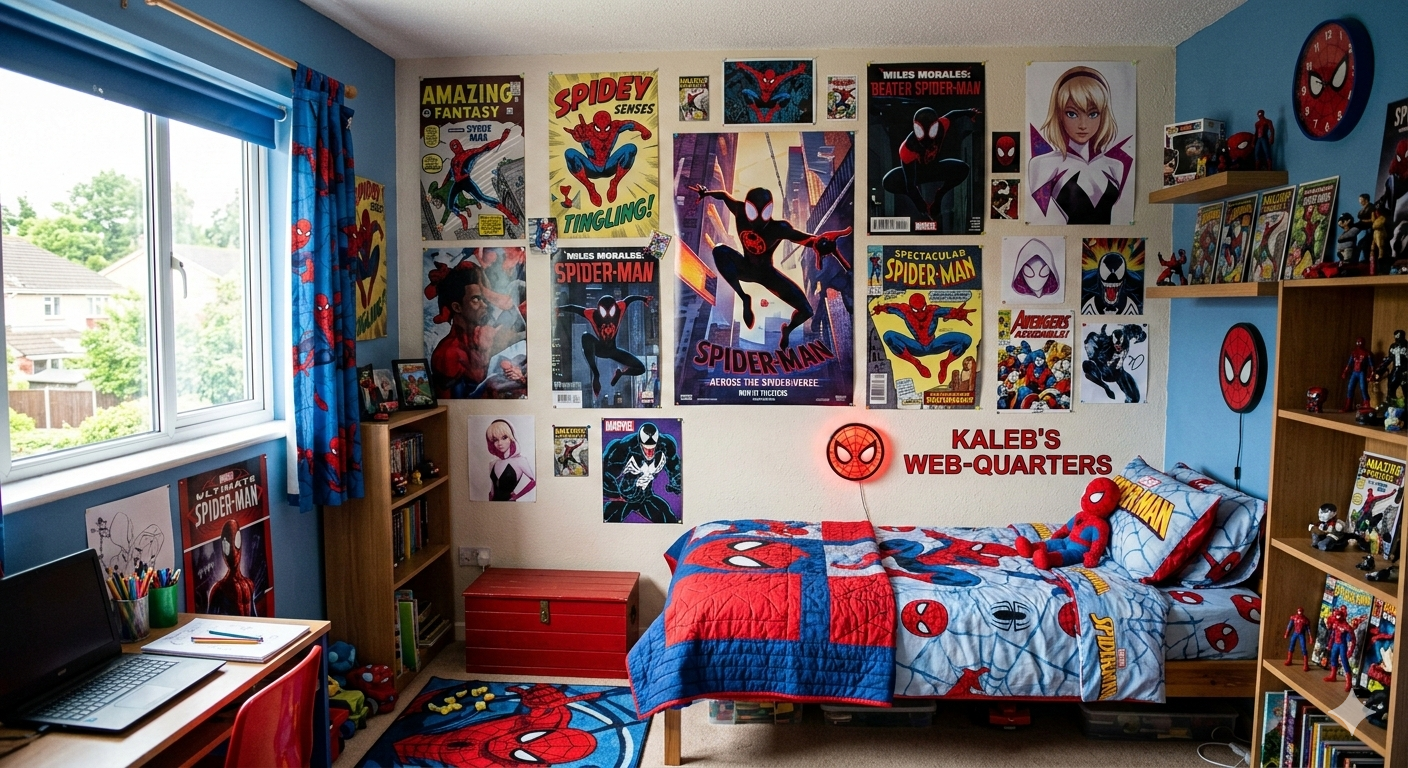
The essentials before you choose
Three things decide how a poster wall turns out: the fixing height, set to the eye level of whoever lives in the room, the gap left between the frames, and how the tones sit with the rest of the furniture. Each one is set differently depending on the space you have; we go through the criteria below.
Why a badly placed poster ruins your whole Spider-Man decor
You have invested in some superb Spider-Man posters. You chose them carefully, going for your favourite scenes and your favourite versions of the hero. But once they are up on the wall, the result disappoints you: the whole thing lacks harmony, the posters look lost on the wall, or the opposite, far too cramped.
Thousands of Spider-Man fans run into this problem. The reason? Arranging posters is not just a matter of hanging them on the wall. It is a genuine art of visual composition.
A badly placed poster can spoil the effect you were after, create an impression of clutter or simply go unnoticed. A well-composed gallery wall, on the other hand, turns an ordinary bedroom into a real Spider-Man sanctuary, creating an immersive and coherent atmosphere.
The Spider-Man universe offers exceptional visual richness: from vintage comics to modern film posters, from stylised illustrations to on-set photographs. That diversity is a strength, but it can also create chaos if you do not keep it under control.
The psychological impact of a successful gallery wall
A well-composed Spider-Man gallery wall does more than look pretty. It creates a visual environment that directly influences mood and well-being:
- Structures the space: turns an empty wall into the focal point of the room
- Tells a story: the evolution of Spider-Man through the eras
- Creates a strong identity: it states your passion for the web-slinger's world
- Calms the eye: a balanced composition is reassuring to look at
That narrative dimension chimes especially with the story of Peter Parker, whose evolution over the decades can be told visually through a cleverly composed gallery wall.
The most common mistakes (and how to avoid them)
Before we look at how to arrange your posters properly, let us identify the classic mistakes:
- Hanging them too high: the poster becomes invisible, especially for a child
- Too much or too little spacing: the visual harmony disappears
- Mixing too many styles: vintage + modern + manga with no coherence
- Ignoring the rest of the decor: your posters should talk to the bedding, the lamps, the rug
- Not allowing for growth: leave room for future posters
In this article, we will look at how to create a Spider-Man gallery wall that is harmonious, balanced and able to grow, by mastering the rules of composition, the placement techniques and the staging tricks.
The golden rules of Spider-Man wall composition
Before you drive in a single nail, you need to understand the fundamental principles of visual composition. These rules, used by interior designers, guarantee a professional result.
Rule no. 1: eye height
The universal rule in wall decor: the centre of the poster should sit at eye level. But 'eye level' depends on who is looking:
- For a standing adult: around 145-150 cm from the floor
- For a child of 8-10: around 120-130 cm from the floor
- For a child of 5-7: around 100-110 cm from the floor
- For a teenager's bedroom: 140-145 cm (sitting at the desk or standing)
Adapting to age is crucial for a Spider-Man child's bedroom. A poster hung too high becomes invisible to the child who lives in that space.
Pro tip: if the gallery has several posters, place the centre of the whole arrangement (not of each individual poster) at eye level.
Rule no. 2: harmonious spacing
The spacing between posters has a direct influence on visual harmony. Here are the recommended distances:
- Between two posters of a similar size: 5-10 cm (the width of a hand)
- Between posters of different sizes: 10-15 cm so they can breathe
- Around a dominant central poster: 15-20 cm minimum
- Between the gallery and a piece of furniture: 20-30 cm minimum

These gaps create visual coherence without any feeling of overcrowding. The eye needs to be able to 'breathe' between each element.
Rule no. 3: odd numbers and balance
In design, odd numbers create more harmony than even ones. Go for:
- 1 poster: XXL format, the central centrepiece
- 3 posters: a triangular or aligned composition
- 5 posters: a balanced gallery with a central focal point
- 7 posters: a full, rich gallery wall
If you have an even number (2, 4 or 6 posters), create perfect symmetry to compensate, or add a central element (a clock, a Spider-Man sticker) to break the parity.
Rule no. 4: the focal point
Every successful gallery wall has a focal point: the element the eye is naturally drawn to. In a Spider-Man gallery, that might be:
- The biggest poster
- The poster with the brightest colours
- The poster for your favourite film
- A poster framed differently (a gold frame, 3D relief)
Place that focal point in the centre, or slightly off-centre depending on the composition, and organise the other posters around it.
Rule no. 5: colour coherence
Spider-Man posters naturally play on red, blue and black. For a harmonious gallery:
- Red-dominant: classic posters, action, energy
- Blue-dominant: night-time posters, urban mood
- Black-dominant: black-suit Spider-Man, darker versions
- A balanced mix: alternate the dominant tones to avoid saturation
This colour coherence needs to talk to the rest of the decor: the duvet cover, the rug, the colour of the walls.

In the next section, we will look at the different compositions possible depending on the size of the wall and the number of posters you have.
Spider-Man wall compositions that work
There are several approaches to arranging your Spider-Man posters. Each creates a different mood and suits specific wall and room configurations.
The symmetrical composition: elegance and order
Perfect symmetry creates an impression of order and elegance. Ideal for organised personalities and formal spaces.
Classic configuration:
- 1 large central poster (50x70 cm or bigger)
- 2 identical medium posters on either side (30x40 cm)
- Even spacing throughout
- Perfect alignment in height

This composition works particularly well above a bed or a desk. It creates a strong focal point without visual overload.
Variation for a small space: 3 identical posters aligned horizontally, creating a narrative frieze (for example, the three Spider-Men from the multiverse of Spider-Verse).
The free gallery composition: creativity and energy
This more organic approach mixes different poster sizes with no strict symmetry. It creates a 'collector's wall' effect that real fans love.
Typical configuration:
- A mix of formats (A4, A3, 30x40, 50x70)
- An asymmetrical but visually balanced layout
- Variable spacing that creates rhythm
- The option to add new posters gradually
This composition works well on a large wall (more than 2.5 metres) and lets you tell the whole evolution of Spider-Man: from vintage comics to the modern films.
Tip: before you drill into the walls, lay all your posters out on the floor to test different compositions. Take a photo of the result so you can picture it before fixing anything permanently.

The pyramid composition: balance and stability
The pyramid creates a composition that is visually stable and naturally pleasing to the eye.
Recommended configuration:
- Top: 1 medium poster (30x40 cm) at the top
- Middle: 2 medium posters side by side
- Base: 3 small posters or 1 large landscape poster
This composition is ideal above a narrow piece of furniture (a chest of drawers, a desk) because it widens towards the bottom, creating visual continuity with the furniture.
The horizontal band composition: modern and fluid
A series of posters aligned horizontally creates a modern narrative frieze, particularly effective in teenagers' bedrooms.
Ideal configuration:
- 4 to 6 posters of the same height
- Identical or alternating formats (square/rectangle)
- Even spacing (5-8 cm between each)
- Perfect alignment along the top edge
This composition works exceptionally well for telling a chronology: the evolution of Spider-Man's costumes through the films, for example.
The corner gallery composition: intimacy and density
Concentrating several posters in one corner of the room creates an intense, personal 'passion corner'.
Typical configuration:
- Use the angle formed by two walls
- A dense layout across both surfaces
- A mix of sizes creating a mosaic
- Maximum immersive effect

This approach works particularly well in a reading or gaming corner, creating a completely immersive Spider-Man bubble.
In the final part, we will look at the practical side: fixing, protection, lighting and how to let your gallery grow.
Practical advice for installing your Spider-Man gallery and letting it grow
Once the composition is settled, installing and looking after your gallery wall takes a few precautions if the result is to last and look professional.
Fixing techniques by wall type
The type of wall determines the right fixing method:
- Solid wall (concrete, brick): rawlplugs and screws, very solid
- Plasterboard/plaster: Molly bolts for heavy framed posters, drawing pins for light posters
- Rented wall (no drilling allowed): Blu Tack, 3M Command adhesive strips, no-drill rails
Important: for unframed posters, go for magnetic strips or clip rails, which avoid holes and make changes easy.
Protecting your posters from fading
Spider-Man posters, especially limited editions or vintage ones, can fade over time. To preserve them:
- Avoid direct sunlight: UV rays fade inks quickly
- Use anti-UV glass: if the poster is framed
- Keep the temperature stable: avoid heat sources (a radiator, a lamp too close by)
- Control the humidity: avoid walls exposed to damp
For high-value posters, professional framing with anti-UV museum glass is an investment that preserves the quality for decades.
Lighting your gallery for maximum effect
Lighting completely transforms the visual impact of a gallery wall:
- Directional LED spots: light each poster individually
- LED strip behind the frames: creates a spectacular halo of light
- Indirect lighting: a floor lamp angled towards the wall
- Ambient light: a Spider-Man lamp in colour that reinforces the immersion
Well-judged lighting literally brings your gallery to life, creating a different mood depending on the time of day.
Letting your gallery grow with your finds
A Spider-Man gallery is never fixed. It evolves with your new acquisitions and your tastes:
- Plan for empty spaces: leave 20-30% of margin for future additions
- Create themed zones: vintage comics / modern films / multiverse
- Seasonal rotation: change some posters with the seasons or with film releases
- Document the evolution: before/after photos so you can see the progress
That ability to grow is part of the collector's pleasure and keeps your space visually fresh.
Harmonising with the rest of your Spider-Man decor
Your gallery wall needs to talk to the other decorative elements in the room:

- Bedding: the Spider-Man duvet cover should complement (not repeat) the images on the posters
- Stickers: wall stickers can extend the gallery or create distinct zones
- 3D objects: figures arranged on a shelf below the posters add depth
- Textiles: a throw and cushions picking up the dominant colours of the posters
The aim is to create a coherent Spider-Man decor in which every element reinforces the others without creating visual cacophony.
Budget and ordering your purchases
Creating a complete gallery wall can be an investment. Here is how to prioritise:
- Phase 1: 1 large quality central poster (the centrepiece)
- Phase 2: 2-3 complementary medium posters
- Phase 3: framing for the most precious posters
- Phase 4: gradual additions as opportunities and new releases come along
This step-by-step approach lets you build a coherent collection without spending everything at once, while enjoying a first satisfying visual effect straight away.
Conclusion: your wall tells your Spider-Man passion
A successful Spider-Man gallery wall is never down to chance. It is the result of thinking about composition, visual balance, colour coherence and harmony with the rest of the decor.
By applying the rules of height, spacing and focal point, you turn a simple pile-up of posters into a genuine decorative work that tells your passion for the web-slinger.
Whether you go for an elegant symmetrical composition, a creative free gallery or a modern narrative frieze, what matters is that your wall reflects your personal relationship with Spider-Man. Because just as Peter Parker builds his hero identity step by step, you build your Spider-Man universe poster after poster.
To see all the posters available and start or add to your gallery, explore our full collection of Spider-Man posters and prints.
And to go further with arranging your space, have a look at our guides & advice section, which brings together all our articles devoted to the Spider-Man universe in everyday life.
In the end, your Spider-Man gallery wall is much more than decor: it is a visual manifesto of your passion, a daily source of inspiration, and a constant reminder that, like Spider-Man, you can create something extraordinary out of ordinary elements. You just need to know where to put them.

