
14-Day Money-Back Guarantee
0
The short answer
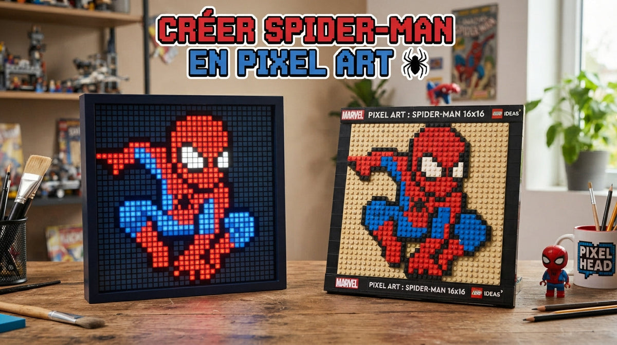
Spider-Man pixel art answers two different urges. On squared paper, a child copies the mask square by square, with no drawing skill needed: the grid given here is sixteen squares a side, so 256 squares, 194 of which get coloured in. On a wall, the peg picture gives you the same image writ large, sharp from a distance. Transfer method, reading the grid, variants and the criteria for hanging it.
Contents
5 mm squared paper: what to put on the tableTransferring square by square: read the grid before you colour itThe mask grid: sixteen squares a side, 256 squares to readVenom and Miles Morales: recolouring the same gridGradients and half-squares: what ruins a gridThe peg picture: what you are actually buyingDistance and light: where to hang a peg pictureAround the picture: a plain poster, stickers and bricks
5 mm squared paper: what to put on the table
Pixel art has one advantage that freehand drawing will never have: it asks for no steady hand. You don't draw a curve, you fill in squares. A child who still struggles with drawing Spider-Man step by step gets a clean mask here, because the grid holds the proportions in place. The only talent required is patience, and you build that by making every step tiny.
5 mm squared paper is the default surface, and you need to know straight away what it gives you. The mask grid is sixteen squares a side. At one printed square per grid square, the finished drawing measures 8 cm by 8: a small square, fine for a first attempt, but not something to hang up, and there is no point promising the child otherwise. For a wall-sized format, allow two printed squares per grid square, so 1 cm: the drawing goes up to 16 cm a side, and every square fills in without a wobble. Only at that size does the question of framing arise, with the pointers from the guide on which poster size to choose and how to hang it.
Four felt-tips make up the kit, but only three are used on this grid: a clear red for the mask, a black for the outline, the eye borders and the web, and a blue for the collar of the suit, which takes up the last row. The very pale grey is only needed if you refuse to leave the eyes as bare white paper. Go for medium nibs and water-based ink: alcohol ink soaks through the sheet and leaves a ghost on the back.
The kit, item by item
5 mm squared paper sheet1
Red felt-tip1
Black felt-tip1
Blue felt-tip1
Pale grey felt-tip (optional)1
Pencil1
Rubber1
Ruler1
Total8 items
Nothing else is needed, and that is the strength of this activity. If the aim is to keep a child busy without buying anything, printable colouring pages take even less preparation, though they leave less pride behind them. And if the wall matters more than the making, a printed Spider-Man poster settles the matter in a single order, with not one square to fill in. Pixel art, by contrast, produces an image the child built themselves, square after square, and that difference decides what they do with it.
Transferring square by square: read the grid before you colour it
Transferring is reading, not drawing. You look at the model, you locate a square, you reproduce it in the same place on your sheet. It all comes down to one word: the marker. Without it, the hand shifts a column and the image distorts without your knowing when. With it, the mistake stays local: you see it on one row, you fix it on one row. This is the quiet workshop to slot in between two livelier sessions of Spider-Man games and toys.
Start by marking out the frame with a pencil and ruler. Number the columns 1 to 16 along the top and the rows 1 to 16 down the side, the same way round as the model. Then work from row 1 to row 16, always left to right. Read each row out loud before you colour it: for row 1, four white squares, eight black, four white. Counting out loud stops the drift: it forces you to say a quantity rather than judge it by eye.
1
Draw the frame One printed square per grid square gives 8 cm a side, two give 16 cm. Decide before you draw.
2
Number it Number the columns 1 to 16 along the top, the rows 1 to 16 down the side. These pencil markers rub out at the end.
3
Call out the row Read the blocks of squares out loud: the voice catches what the eye lets through.
4
Colour from left to right One whole row, in order. Tick it in the margin of the model once it is done.
5
Rub out the markers Wait for the ink to dry, then erase the numbering. The pencil frame can stay.
One method, then, not two. Colouring colour by colour, all the red first, saves time on the paper and loses it elsewhere: one square missed in a corner, and all the filling that follows shifts without anyone noticing until the end. Row by row means putting the cap back on often. That is the price of constant control: with every finished row, you know where you stand.
Tick each finished row in the margin of the model, never on your own sheet. This discipline is the one behind the step-by-step guides in the shop: a clear goal, one step at a time, a check at the end. It travels well to a group session, for instance for a Spider-Man birthday party, where every guest goes home with a finished grid and their name on the back.
The mask grid: sixteen squares a side, 256 squares to read
The grid reproduced below fits into sixteen columns and sixteen rows, so 256 squares: 118 red, 70 black, 6 blue and 62 left as bare white paper. In other words 194 squares to colour and 62 to leave alone. That count is not a detail: it tells you how long the session takes and when you are halfway. Row 1 contains no red at all; row 4 contains fourteen out of sixteen.
| # | 1 | 2 | 3 | 4 | 5 | 6 | 7 | 8 | 9 | 10 | 11 | 12 | 13 | 14 | 15 | 16 |
|---|---|---|---|---|---|---|---|---|---|---|---|---|---|---|---|---|
| 1 | ⬜ | ⬜ | ⬜ | ⬜ | ⬛ | ⬛ | ⬛ | ⬛ | ⬛ | ⬛ | ⬛ | ⬛ | ⬜ | ⬜ | ⬜ | ⬜ |
| 2 | ⬜ | ⬜ | ⬛ | ⬛ | 🟥 | 🟥 | 🟥 | 🟥 | 🟥 | 🟥 | 🟥 | 🟥 | ⬛ | ⬛ | ⬜ | ⬜ |
| 3 | ⬜ | ⬛ | 🟥 | 🟥 | 🟥 | 🟥 | 🟥 | 🟥 | 🟥 | 🟥 | 🟥 | 🟥 | 🟥 | 🟥 | ⬛ | ⬜ |
| 4 | ⬛ | 🟥 | 🟥 | 🟥 | 🟥 | 🟥 | 🟥 | 🟥 | 🟥 | 🟥 | 🟥 | 🟥 | 🟥 | 🟥 | 🟥 | ⬛ |
| 5 | ⬛ | 🟥 | 🟥 | ⬛ | ⬛ | ⬛ | 🟥 | 🟥 | 🟥 | 🟥 | ⬛ | ⬛ | ⬛ | 🟥 | 🟥 | ⬛ |
| 6 | ⬛ | 🟥 | ⬛ | ⬜ | ⬜ | ⬜ | ⬛ | 🟥 | 🟥 | ⬛ | ⬜ | ⬜ | ⬜ | ⬛ | 🟥 | ⬛ |
| 7 | ⬛ | 🟥 | ⬛ | ⬜ | ⬜ | ⬜ | ⬛ | 🟥 | 🟥 | ⬛ | ⬜ | ⬜ | ⬜ | ⬛ | 🟥 | ⬛ |
| 8 | ⬛ | 🟥 | 🟥 | ⬛ | ⬛ | ⬛ | 🟥 | 🟥 | 🟥 | 🟥 | ⬛ | ⬛ | ⬛ | 🟥 | 🟥 | ⬛ |
| 9 | ⬛ | 🟥 | 🟥 | 🟥 | 🟥 | 🟥 | ⬛ | 🟥 | 🟥 | ⬛ | 🟥 | 🟥 | 🟥 | 🟥 | 🟥 | ⬛ |
| 10 | ⬜ | ⬛ | 🟥 | 🟥 | 🟥 | ⬛ | 🟥 | 🟥 | 🟥 | 🟥 | ⬛ | 🟥 | 🟥 | 🟥 | ⬛ | ⬜ |
| 11 | ⬜ | ⬛ | 🟥 | 🟥 | ⬛ | 🟥 | 🟥 | 🟥 | 🟥 | 🟥 | 🟥 | ⬛ | 🟥 | 🟥 | ⬛ | ⬜ |
| 12 | ⬜ | ⬜ | ⬛ | 🟥 | 🟥 | 🟥 | ⬛ | 🟥 | 🟥 | ⬛ | 🟥 | 🟥 | 🟥 | ⬛ | ⬜ | ⬜ |
| 13 | ⬜ | ⬜ | ⬛ | 🟥 | 🟥 | 🟥 | 🟥 | ⬛ | ⬛ | 🟥 | 🟥 | 🟥 | 🟥 | ⬛ | ⬜ | ⬜ |
| 14 | ⬜ | ⬜ | ⬜ | ⬛ | 🟥 | 🟥 | 🟥 | 🟥 | 🟥 | 🟥 | 🟥 | 🟥 | ⬛ | ⬜ | ⬜ | ⬜ |
| 15 | ⬜ | ⬜ | ⬜ | ⬜ | ⬛ | ⬛ | 🟥 | 🟥 | 🟥 | 🟥 | ⬛ | ⬛ | ⬜ | ⬜ | ⬜ | ⬜ |
| 16 | ⬜ | ⬜ | ⬜ | ⬜ | ⬜ | 🟦 | 🟦 | 🟦 | 🟦 | 🟦 | 🟦 | ⬜ | ⬜ | ⬜ | ⬜ | ⬜ |
The eyes are the area to get right first: they are the only place where being one square out shows immediately. They are two identical white blocks, three squares wide by two high, sitting on rows 6 and 7: columns 4 to 6 on the left, columns 11 to 13 on the right. Six squares each, twelve in all. Each is bordered in black on all four sides, so no white square ever touches a red one. Count the first from the left edge, the second from the right edge.
The web is not drawn in thin lines: the smallest unit available is the whole square. It is therefore suggested by ten isolated black squares, all below the eyes. Two staircases run down towards the cheeks: row 9 column 7, row 10 column 6, row 11 column 5 on the left, and their exact mirror on the right. Two more head back down and meet on row 13, in a black bar two squares long, columns 8 and 9. It is very little, and that is deliberate: the more black you add, the less the mask reads from a distance. The guide to Spider-Man masks shows this pattern on a real mask.
The rest of the black goes round the outside. The outline starts on row 1, where eight black squares in a line form the top of the head, then runs down each side, spreading outwards to row 4, where it touches both edges, before closing in again towards the bottom. It only breaks at the foot of the face, where the mask meets the collar: the last row carries six blue squares, columns 6 to 11, the only patch of blue in the drawing.
Reducing a face to 256 squares forces you to keep only what identifies it: two white patches, an outline running all the way round the face, ten squares of web. This is the same simplifying work John Romita Sr. did on the character's face, or the work that produced the Spider-Man logo: a recognisable sign made with the fewest possible lines, pushed here as far as the solid square.
Venom and Miles Morales: recolouring the same grid
Once the mask is finished, the same grid can be recoloured without moving a single square, and that is where the exercise pays off. The principle is mechanical: the more a character relies on flat, contrasting blocks of colour, the better they hold up in pixel art. Suits with gradients collapse the moment you reduce them to solid squares. So look at the costume as a list of colours. The Spider-Man universe page lists the versions that come up most often.
Venom is the easiest candidate: replace all the red with black, leave the twelve eye squares white, turn the collar grey. You get a symbiote that reads in black and white without redrawing anything: 124 squares change pen, the 118 red ones going to black and the 6 blue collar squares going to grey; the 70 black squares and the 62 white squares stay put. The open jaws, the fangs and the pink tongue of the Venom peg picture need a grid far wider than sixteen squares: the mouth does not exist in this model. The guide to Venom and the symbiotes sorts through the catalogue.

Spider-Man Pixel Art - Venom
The black frame holds a grey background, and on it Venom's open jaws: pink tongue, white fangs, black body. Up close you see every round peg, from a distance the image closes up. For a teenager's bedroom.
View the product - from €99.90Miles Morales works for an even more direct reason: his mask is the negative of the first. Wherever the grid calls for red, put black; wherever it calls for black, put red. The 118 red squares become black, the 70 black ones become red, the twelve eye squares stay as they are and the blue collar turns red. The contrast improves, which forgives a lot of transfer mistakes. This is the version to give the child who struggled with the first one.
A third, freer option: keep the mask as it is and change only the background. The fifty white squares around the head do not have to stay white; the twelve eye squares, on the other hand, must. A black background under a red mask gives a far more graphic image, close to a framed picture on a dark wall. It is the quickest way to fill a second sheet without starting the counting again.
Gradients and half-squares: what ruins a grid
The first mistake is wanting to soften things. Pixel art has no gradient: each square is a single colour, solid, with no transition to its neighbour. The moment you try to blend red into black to tone down the web, the image loses its legibility. If it is an effect of texture and light you are after, this is not the medium: look instead at printed canvases and wall art, which are made for that.
The second is the half-square. It happens when you want to round off a corner of the outline or refine a staircase of web: you colour half a square, then another half, and the grid stops being a grid. The outline contains whole squares only, including where it looks too angular. That stepped look is not a fault to be corrected: it is what makes the image hold up at a distance.
The third concerns pressure. On squared paper the felt-tip stays in one place long enough to fill the square, and the fibre eventually gives way: the colour soaks through and the neighbouring square picks up a tint from the back. Set the nib down, make two strokes back and forth, move on to the next. The pencil markers, meanwhile, must stay light: a heavy line leaves a grey trace under the red, invisible on the table and perfectly visible once the sheet is up on the wall.
The five mistakes that ruin a grid
- The gradient One square, one colour. A blend between two squares muddles the image and cannot be undone.
- The half-square The outline does not get rounded off: half a square shifts the next row.
- The model set at an angle Lay the grid flat, the same way round as the sheet. Tilted, it shifts your reading by a square and throws out the whole transfer.
- The frame drawn by eye Follow the printed squares, ruler down. A frame drawn by eye narrows and the image leans.
- The skipped row The transfer goes row after row. Finishing the eyes first means recounting everything afterwards.
The fourth comes down to the model itself. A grid printed too small is hard to read, especially in the areas where black and red alternate square by square, around the eyes and along the staircases of web. Lay it flat beside your sheet, the same way round, and do not hold it in your hand. To dress a wall straight away, with none of these constraints, a ready-made Spider-Man decoration remains the shortest route.
The peg picture: what you are actually buying
The ready-made pixel art picture is not a print. It is a rigid gridded board onto which you fix thousands of round pegs, one by one, following a supplied plan. Up close, the mosaic is visible: each peg stands proud and catches the light. From a distance, the pegs close up and the image becomes sharp. It is the principle of the felt-tip grid at a different scale, with a black frame around it.
You need to understand what you are buying: a decorative object, but also an activity. Assembly goes peg by peg, area by area, with the same discipline as row by row on paper. The number of pegs and the assembly time are not stated on the product page: assume this is not a quick build, and read the instructions before making it a last-minute gift.

Spider-Man Mask Pixel Art
A square with a black frame, and inside it the mask in close-up: red, black webbing, large white eyes rimmed in blue. Up close the mosaic of pegs, from a distance a sharp image. For a wall with no focal point.
View the product - from €99.90On budget, the peg pictures in the Spider-Man pixel art collection start at €99.90. That price pays for the size, the frame and above all the thousands of pegs to be placed one by one; it does not compare with the price of a poster, which you simply hang up. It is a gift that stands up for an adult or an older teenager, in the same vein as the premium Spider-Man gifts.
That leaves the question of the subject. A mask in close-up is head-on and symmetrical: it stands being looked at every day without tiring. A scene or a character in action reads quickly, then wears out faster on a wall you pass all the time. The guide to Spider-Man merchandise places this tier against the rest of the catalogue, which helps you decide whether the object deserves its wall.
Distance and light: where to hang a peg picture
A peg picture has one constraint the other decorations do not: it needs distance. At arm's length you see only the mosaic; it is pretty, but it is no longer Spider-Man. The image only closes up at a certain distance, the distance of a bed or a sofa. So choose the wall you look at from far away and for a long time, not the one you brush past.
In a child's bedroom, the wall facing the bed is the right spot, at a height set by the child's size and not yours. Above a desk the picture works less well: you are too close for the image to form. In a living room or a gaming corner it becomes a centrepiece and copes very well with being alone on its wall, whereas a tapestry asks on the contrary to fill every bit of available surface.
| Location | What the picture gains there | The pitfall |
|---|---|---|
| Wall facing the bed | The distance takes care of itself from the pillow | Hanging it at adult height |
| Above a desk | Visible all day long | Too close: you only see the pegs |
| Living room or gaming corner | A centrepiece, holds its wall alone | Head-on lighting, which flattens it |
| Hallway | Nothing: you pass too fast and too close | The emptiest wall, the least suitable |
| Side wall, near a window | Raking light brings out the pegs | Backlighting that darkens it |
Lighting changes everything, and it is the point most often discovered after the fact. Head-on light flattens the pegs: the image goes back to being a flat print. Light arriving from the side creates a tiny shadow under each peg and reveals the texture. A Spider-Man lamp placed beside it, or a Spider-Man neon sign set as raking light, give that result with no complicated installation.
For fixings and composition, the rules are those of any heavy frame, set out in the guide to the gallery wall. A peg picture weighs more than a framed poster: check what the wall is made of before you drill, and avoid a single central hook, which lets the whole thing swivel at the slightest knock. Two spaced fixing points, a spirit level on the frame before you tighten, and it stays straight without your having to come back to it.
Around the picture: a plain poster, stickers and bricks
A single picture on a bare wall looks orphaned, however good it is. The composition is built around it, with one rule: pixel art hates competition. Already very graphic, it is better surrounded by quiet elements than by strong images. One large, plain poster beside it beats three small chatty frames, and the guide to posters by character helps you pick the one that will not fight it for attention.
Then there are Spider-Man stickers, the most flexible addition, because they fill the gaps without drilling into the wall. The thing to check before buying is the adhesive and the surface: the guide on which type of sticker to choose explains which ones peel off without taking the paint with them, which matters in a child's bedroom as much as in rented accommodation. Put them back from the picture rather than around it: the black frame needs air to stand out.
To carry it over into objects, bricks are the most natural next step: same gesture, one module, one place, a plan to follow. The sets in the Spider-Man LEGO collection take over for anyone who wants to build bigger, as set out in the Spider-Man LEGO guide. A box of bricks is nothing like a peg picture: it comes apart and goes back together, whereas the picture is fixed once and for all.

Spider-Man Pixel Figure
A build-it-yourself figure in red and blue micro-bricks: square head, large white eyes rimmed in black, 'BRICKS' box and instructions included. Marked 14+ on the packaging: a fiddly build, best done in good light.
View the product - €22.90Mind the age rating, though. The micro-brick figure above is marked 14+ on its packaging, and that is not a token precaution: the pieces are tiny and the instructions need proper reading. At €22.90 it makes a solid secondary gift for a teenager or an adult, and it sits on a shelf below the picture, where it links the wall to the rest of the room.
What to take away
Spider-Man pixel art covers two urges with the same logic. On 5 mm squared paper, the mask grid fits into sixteen squares a side: 256 squares, 194 of them to colour and 62 left as bare paper. One printed square per grid square gives 8 cm, fine for a first attempt; two take the drawing to 16 cm, and only then are we talking about an image worth putting up. Number before you colour, work row by row, keep each square a single colour: the first attempt is already presentable.
On a wall, the peg picture plays in another league. It is not a print but an assembly of thousands of round pegs, so an activity as much as a decoration, and that is paid for in build time. It needs distance to read, raking light for its relief and serious fixings given its weight. Chosen with those three criteria in mind, it holds a whole wall.
For the rest, the rule is not to drown an image this graphic: a plain poster, a few stickers set back, an object to assemble on a shelf. If the whole room is up for rethinking, the guide to creating a complete Spider-Man bedroom gives the order to work in; if the budget is tight, ten simple, affordable decorating ideas tell you where to start.
Start with the felt-tip grid: it costs next to nothing, it fits into one session and it will tell you whether pixel art goes down well at home. If the trial takes, the peg picture is the logical next step, provided you set aside a wall that gets looked at from a distance.

