
14-Day Money-Back Guarantee
0
The short answer
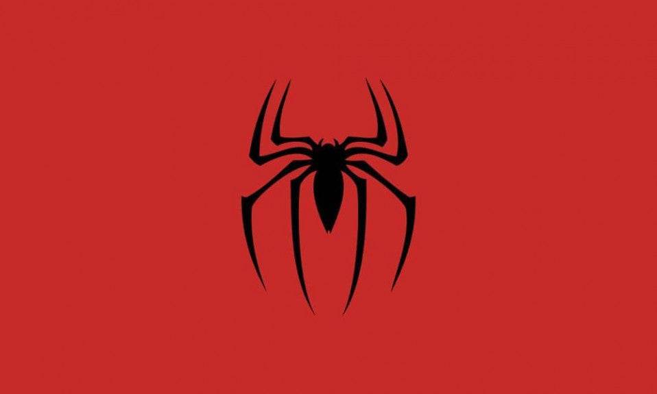
Steve Ditko is the artist who came up with that arachnid silhouette, designed to stay recognisable even at a tiny size or in the middle of the action. The red-and-black contrast carries a duality: energy and youth on one side, danger and guilt on the other. We trace its transformations below.
An Iconic Symbol Born in the Earliest Marvel Comics
The Spider-Man logo, a stylised black spider placed in the centre of his chest, is one of the most famous visual elements in global pop culture. It first appeared in August 1962, in the issue Amazing Fantasy #15, which also marks Spider-Man's debut. This historic issue, written by Stan Lee and drawn by Steve Ditko, introduces Peter Parker, a shy teenager who gains his powers after being bitten by a radioactive spider. From the very first panel in which Peter puts on the costume, the spider symbol already sits at the centre of his outfit.
But unlike other superheroes of the era (Superman or Batman, for instance), whose logos were often flamboyant or exaggerated, Spider-Man's stands out for its restraint and its symbolic reach. This is no mere decorative motif: it is a direct representation of the event that triggered his transformation. The spider is not just an animal, it is the catalyst of his destiny. It is at once the origin of his powers, the reminder of his responsibilities and the reflection of his loneliness.

From an artistic point of view, Steve Ditko designed the logo with a clear intention: it had to be instantly identifiable even in a small format, in motion, or from a distance. Choosing a black spider on a red background – a very high contrast – answers a need for legibility, but also for duality. Red suggests energy, passion, youth. Black, by contrast, suggests mystery, danger, guilt – all themes woven into the character of Peter Parker. That visual contrast is as strong a signature as his crouching pose or his webs strung between the skyscrapers.
Finally, this logo cannot be separated from Spider-Man's philosophy: “With great power comes great responsibility.” The spider on his chest is a permanent reminder of that tragic lesson, passed on after the death of his Uncle Ben. It is not there to look pretty: it embodies that moral weight, that inner pact Peter makes with himself.
This link between design and storytelling is fundamental: the costume and its logo tell a story. That is why, more than 60 years after it was created, the Spider-Man logo still fascinates. It has never been a simple drawing. It is the beating heart of the web-slinger.
To dig deeper into the hero's early days, you can read our page on Peter Parker, which goes into detail about his origins, his personality and his inner battles.
A Visual Evolution Through the Decades
While the original Spider-Man logo drawn by Ditko is still anchored in the collective imagination, it has never stopped evolving over the decades, adapting to different eras, media and narrative tones. Every version of Spider-Man – whether it comes from the comics, the films, the animated series or the video games – has offered its own reading of the famous symbol.
In the Sam Raimi trilogy with Tobey Maguire, the logo is bigger, metallic and three-dimensional. It reflects the dramatic, solemn nature of this version of Peter Parker. On the black suit in Spider-Man 3, the logo grows even wider and turns white, inspired by the symbiote costume from the comics, underlining the hero's more aggressive, uncontrollable side.

With Andrew Garfield, in The Amazing Spider-Man, the logo becomes sleeker. It grows more dynamic, with a longer, more stretched spider stance to suggest the character's agility. This more teenage, rebellious version suits the edgier mood of that run of films. The lines are cleaner, the contrasts sharper, and the logo plays on elegance rather than on strength.
In the Marvel Cinematic Universe, with Tom Holland, the logo turns minimalist, almost technological. On the suit designed by Tony Stark, the spider becomes a functional part: it can even detach as a drone, as it does in Spider-Man: Homecoming. This version reflects an era in which the superhero is also a product of innovation. The logo becomes a symbol of evolution, but also of absorption into a much wider universe.
Finally, in the animated films Into the Spider-Verse and Across the Spider-Verse, styles explode in every direction. Every version of the hero wears a unique logo. Miles Morales spray-paints his own symbol in black on red, breaking with tradition. It is an act of ownership, a declaration of freedom. Spider-Gwen, Spider-Man Noir, Peni Parker... they all display their own variation on the icon, which shows just how universal the symbol is. The logo becomes the link between dimensions, a web connecting every hero.
To see these modern incarnations of the web-slinger, take a look at our Spider-Man figures collection, where you will find the most striking designs from the different universes, from the MCU to the animated films.
You can also read our page dedicated to the Spider-Verse to discover every alternative Spider-Man and their unique visual identity.

A Logo That Became a Global Pop Culture Icon
Over the decades, the Spider-Man logo has moved far beyond comics and screens to become a genuine global cultural symbol. Simple, striking and loaded with meaning, it has established itself as one of the most recognisable logos on the planet – right alongside those of Superman and Batman. But where those two often embody strength or justice, Spider-Man's speaks of resilience, responsibility and human vulnerability.
Today you will find it on a huge range of merchandise: t-shirts, mugs, bags, phone cases, toys, posters, trainers… Every version reinvents the spider without ever betraying its essence. Brands such as Nike, Uniqlo and Havaianas have even worked with Marvel on collections inspired by the hero. The graphic simplicity of the logo makes it easy to style and to fold into contemporary fashion and design.
Speaking of which, our Spider-Man phone cases collection showcases several designs inspired by the different versions of the logo, perfect for showing your style with a little subtlety.
But perhaps the most fascinating thing is the emotional identification it triggers. In children, it stands for bravery, courage and daydreams. In adults, it recalls a lesson learnt early: do the right thing, even when it is hard. It is a logo that speaks to everyone, because it reflects a universal inner struggle. It represents the weight of our choices, the consequences of our actions, and the possibility of changing the world by starting with yourself.
The Spider-Man logo is not just a brand. It is a compass. A promise. And that is why, generation after generation, it keeps fascinating and inspiring millions of fans around the world.
To carry on exploring the hero and his universe, do not miss our article Why Parents Keep Buying Spider-Man Generation After Generation, a look at the cross-generational power of the icon.
The Spider-Man Logo: Between Heritage and Future
As the films, comics and series keep multiplying, the Spider-Man logo stays impressively consistent. Whether it is stylised for the needs of the multiverse, modernised for an animated series, or turned into a piece of technology in the MCU, its essence stays intact. It is not simply a motif: it is a visual language. It embodies a vision of the hero that is singular, vulnerable and human – and that is precisely what makes it universal.
In a world saturated with superheroes in flamboyant costumes and loud logos, Spider-Man's stands out for its restraint, its symbolism and its ability to evolve without losing its soul. It is at once a reminder of his origins, a proof of identity and a link between every iteration of the web-slinger, from Peter Parker to Miles Morales.

Conclusion
The Spider-Man logo, that simple spider drawing, is far more than a graphic symbol: it condenses everything the character stands for. It carries the pain, the responsibility, the growth and the quiet heroism. Since 1962 it has walked alongside readers, viewers and fans in an intimate relationship with the web-slinger.
And if it still resonates today, it is because it reflects a timeless truth: every one of us has, at some point, faced the choice of doing the right thing despite the difficulty. This logo reminds us that you can be a hero, not by having powers, but by taking responsibility.
Fancy celebrating this icon every day? Take a look at our Spider-Man t-shirts and our masks inspired by the different versions of the hero, and wear with pride the spider that has been inspiring people for over 60 years.

