

14-Day Money-Back Guarantee
0
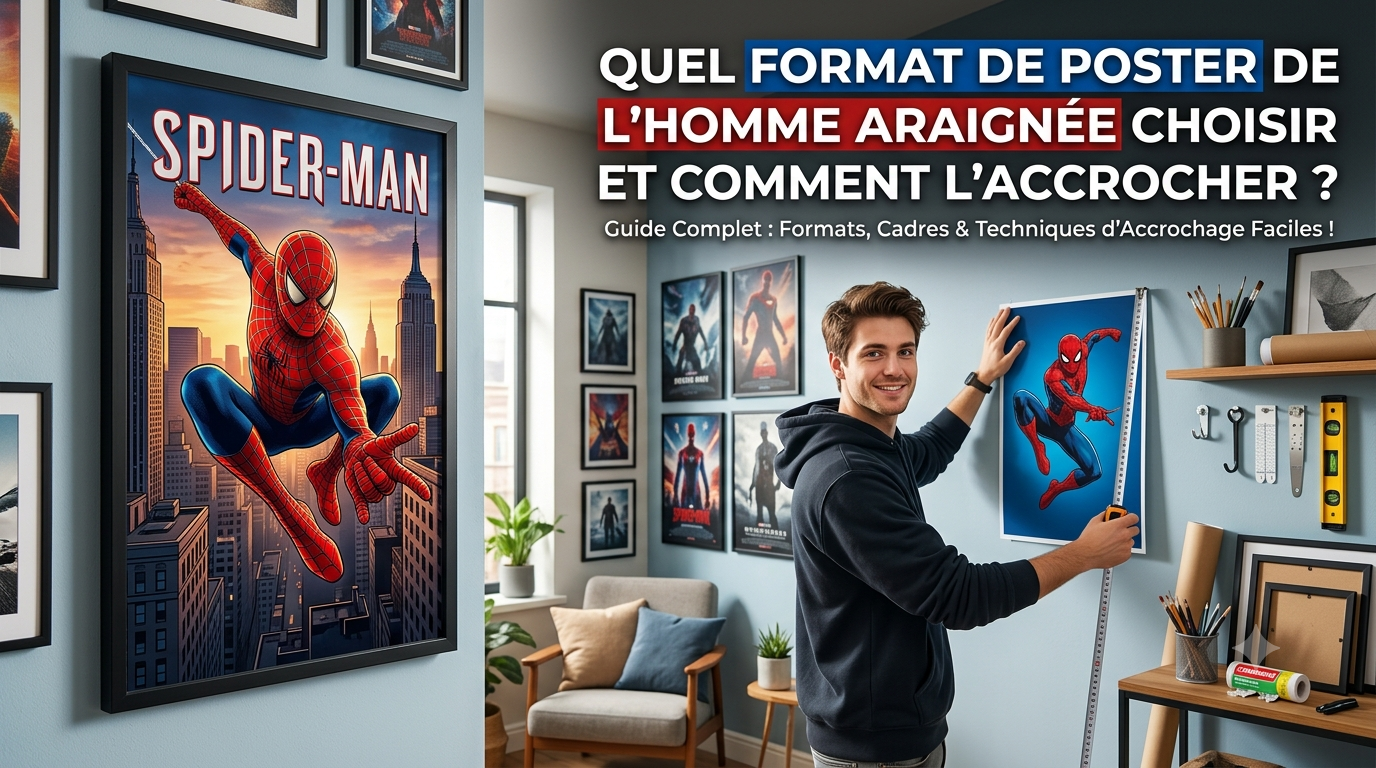
The essentials before you choose
Three rules are enough. The size follows the wall, not your taste: aim for roughly two thirds of the width of the furniture below. The height is measured at the centre of the poster, 150 cm off the floor for an adult and considerably lower in a child's bedroom. And the fixing is chosen to suit the wall, not the weight printed on the adhesive packaging.
You have picked the image. What is left is the part nobody explains: which size to order, how high to hang it, and how to fix it without tearing off the paint the day you take it down.
This guide covers the doing, not the choosing. If you are still deciding on the image itself, our guides by style and by character cover that stage.
Choosing the size: go by the wall, not by taste
It is the most common and most expensive mistake: you pick a size on screen, it arrives, and it looks tiny on the wall. Size is never decided in the abstract, it follows whatever surrounds it.
The common sizes and what they actually fill
A3, around 30 by 42 centimetres, stays discreet: it works above a desk, in a hallway, or as part of a group. On its own on a large wall, it disappears.
A2, around 42 by 60 centimetres, is the all-rounder. It holds its own above a child's bed or a chest of drawers without overwhelming the room.
50 by 70 and 61 by 91 are the cinema poster sizes. These are the ones that create a focal point in a bedroom, and they are also the least forgiving of a placement error: badly centred, they throw the whole room off balance.
The two-thirds rule
One simple, reliable principle: a poster hung above a piece of furniture should fill between half and two thirds of its width. Above a one-metre chest of drawers, aim for 50 to 70 centimetres wide.
Below half, the arrangement looks accidental. Beyond two thirds, the poster dominates the furniture and the balance breaks. The same rule applies to a bed: measure the width of the mattress and use the same proportion.
Portrait or landscape?
A vertical format visually lengthens a wall and suits narrow spaces or low ceilings. A horizontal one widens, and works better above a bed or a sofa, where it follows the line of the furniture.
If in doubt on an open wall, vertical is the safer bet: it copes better with being slightly off-centre, whereas a badly placed horizontal is noticed straight away.

Retro Spider-Man Poster
A retro image that works just as well on its own as in a group, in a size that slots easily above a desk. The whole selection sits in our Spider-Man prints.
View product — €16.90How high to hang it
This is the setting that separates a considered piece of decor from a poster stuck up at random, and a tape measure sorts it out.
The 150 centimetre rule
The convention comes from museums: the centre of the image sits around 150 centimetres off the floor, which matches the eye level of a standing adult. It is not the top of the poster you measure, it is the middle.
In practice, for a poster 60 centimetres tall, the top edge ends up 180 centimetres off the floor. Most people hang too high, out of reflex.
Above furniture or a bed
The rule changes when the poster sits above something. Leave 15 to 25 centimetres between the top of the furniture and the bottom of the frame. Less than that and the arrangement looks cramped; more and the poster floats, losing its link with the furniture.
Above a bed, go slightly higher so the pillow does not knock against the frame, and to rule out any risk of a bump to the head.
In a child's bedroom, go lower
This is the point most guides forget. A six-year-old's eye level is around 110 centimetres off the floor. Hanging at adult height means decorating for the parents.
Aim instead for a centre between 110 and 130 centimetres depending on age. The child sees the poster, looks at it from the bed or the play mat, and the object makes sense. We apply the same logic to the whole room in our guide to creating a complete Spider-Man bedroom.
Hanging it without damaging the wall
The question that holds people back the most, especially in rented flats. There are good solutions, and a few that only look good.
The no-drill options
Removable double-sided adhesive strips are the current benchmark: they hold a decent load and come away by stretching the tab, without pulling the paint off. Their one condition is a surface that is perfectly clean, dry and smooth.
Adhesive putty suits light unframed posters, but it leaves greasy marks on matt paint and yellows over time. Keep it for temporary displays.
Adhesive hooks, finally, carry heavier frames than strips alone, provided you respect the curing time before hanging anything — usually an hour. It is the most ignored instruction, and the first cause of a fall.
When drilling is still the answer
Beyond two or three kilos, or with a glass frame, drilling remains the only genuinely safe option. In a child's bedroom it is a safety question rather than a matter of comfort.
On plasterboard, a plain screw will not hold: you need a fixing matched to the type of board. On concrete or brick, a standard wall plug does the job with the right drill bit.
What does not hold, whatever the packaging promises
Ordinary adhesives on matt paint or textured wallpaper: the surface comes away before the adhesive does. Drawing pins on a poster you care about: they perforate it for good. And any adhesive applied to a dusty or freshly painted wall — paint needs several weeks to harden fully.

Spider-Man Canvas Poster
A print on canvas, stiffer than a paper poster and therefore easier to fix without framing. Our prints round out the range of paper sizes.
View product — €16.90Frame it, or leave it bare?
The three options do not cost the same and do not send the same signal.
The bare poster
Cheap, light, easy to swap. It is the sensible choice when the decor has to evolve with a child's tastes, or when you want to test a spot before committing.
Its weakness is how it ages: the corners curl, the paper yellows faster without protection, and the smallest knock leaves a permanent mark.
The frame
It protects, gives structure, and instantly moves the poster from print to decorative object. A slim dark frame suits almost any image; thick or coloured frames compete with it.
If the poster is destined for a child's bedroom, choose a frame with acrylic glazing rather than glass. It weighs less, it does not break, and it changes everything where safety is concerned.
Stretched canvas
It removes the framing question altogether and gives a result closer to a painting. It hangs easily, does not reflect light, and copes with humidity better than paper. We go into this format in our guide to canvas wall art and prints.
Building a wall of several posters
Going from one poster to several changes the rules completely, and this is where most arrangements fall apart.
The aligned arrangement
Two or three identical sizes, lined up horizontally or vertically, with even spacing. It is the safest and quickest solution: it asks for no particular artistic eye and works in almost any room.
The reference spacing sits between 5 and 8 centimetres. Below that, the group reads as one confused image; beyond 10, the pieces come apart and no longer form a group.
The free arrangement
Mixed sizes, asymmetric layout. Far livelier, but it needs an invisible rule to stop it becoming a mess: line up either the top edges or a shared centre line, and let the rest organise itself around that.
The trick that saves you: cut newspaper templates to the dimensions of each poster, tape them to the wall with masking tape, and live with them for two days before you drill anything.
Mixing worlds
A wall given over entirely to one character saturates quickly. Alternating registers — a film poster, a graphic image, a more abstract illustration — gives the eye room to breathe without breaking the theme. Our simple, affordable decor ideas suggest several combinations of this kind, and our guide to choosing the image helps you pick pictures that talk to each other.

Watercolour Spider-Man Poster
A watercolour treatment that pairs well with more graphic images in a wall arrangement. Combine it with our lamps and our gift ideas.
View product — €16.90Making it last
A well-hung poster can last for years, or degrade in a single season. Three factors decide.
Direct light. It is enemy number one. A poster facing a south-facing window loses its reds within a few months — and the reds, on this character, are most of the image. Move it to another wall if you can.
Humidity. Bathrooms are out, obviously, but so are poorly insulated external walls where condensation makes the paper buckle. A canvas or a glazed frame stands up far better in those conditions.
Forgotten adhesives. A strip left in place for three years becomes very hard to remove cleanly. If the poster is meant to stay for the long term, go straight to a mechanical fixing.
Matching the poster to the room
The same image is not hung the same way everywhere. Four situations come up again and again, each with its own constraints.
The child's bedroom
Low height, generous size, no glass. This is the room where the poster is looked at and handled the most: a child touches it, peels back a corner, pulls on it. A closed acrylic frame settles the question.
Avoid the wall behind the headboard if the child is young: anything hung above a bed eventually worries parents, often with reason. The wall facing the bed works better, and the child sees it while falling asleep.
The desk or homework corner
Modest size, seated eye level — around 110 to 120 centimetres off the floor, noticeably lower than the standing rule. An A3 or an A2 is plenty, and a pair of small sizes often works better than one large one.
Watch out for reflections: a glazed frame placed opposite a window or under a ceiling light becomes unreadable at exactly the hours the child is working.
The hallway and circulation spaces
These are the most underused spots. A hallway takes a run of small sizes in a line very well, seen close up and on the move. A large format, by contrast, is seen from too close to be appreciated.
The living room or shared space
Here the poster competes with grown-up decor. A canvas or a slim dark frame goes down far better than a bare print, and a graphic or retro image fits in where a film poster would read as a teenager's bedroom. That is exactly the reasoning we set out in our guide by style.
How many posters for one room?
A simple question with a counter-intuitive answer: fewer than you think.
In a standard bedroom, one wall carrying images is enough. The other three stay bare or take functional pieces — a shelf, a wall light, hooks. Spreading posters across all four walls cancels out the effect of each one and tires the eye.
On that single wall, count on one large format on its own, or three to five small ones as a group. Odd numbers work better than even ones for free arrangements, even numbers better for symmetrical lines.
Finally, keep a margin around the arrangement: at least 20 centimetres between the outer edge and the corner of the wall or the ceiling. A poster stuck too close to a corner always looks badly hung, even when it is perfectly straight. The rest of the mood comes from the duvet covers and the soft toys that dress the room. To go further on this subject, see also Spider-Man stickers: which type to choose to decorate without damage.
The mistakes that keep coming back
Hanging too high. The universal reflex. Measure, do not judge by eye.
Choosing the size on screen. An image that fills your screen does not fill a wall. Always mark the real dimensions on the wall with paper before you buy.
Ignoring the curing time of adhesives. An hour of waiting saves you a frame on the floor and a chipped wall.
Decorating at adult height in a child's bedroom. The poster is for them, so it belongs at their height.
Overloading a wall. One well-placed poster does more than six hung at random. The empty space around the image is part of the arrangement.
The kit that helps, and the kit you can skip
Hanging a poster properly asks for almost nothing, but the three right tools genuinely change the result.
A tape measure and a pencil. Mark the wall lightly and rub it out afterwards. Judging by eye always produces a gap of several centimetres, obvious the moment you step back.
A spirit level, or the level app on a phone, which does the job perfectly well. A poster half a degree off is noticed, especially next to a door or a skirting board that gives a horizontal reference.
Masking tape for the paper templates. It is the step everyone skips and the one that avoids the costliest mistakes, particularly before drilling for a multi-piece arrangement.
A plumb line, a set square and a hanging kit bought separately, on the other hand, are surplus to requirements at home. The fixings supplied with a decent frame are enough in almost every case.
And if the poster arrives rolled up?
Most prints travel in a tube, so they arrive curled. Hanging them as they are guarantees edges that lift after a few days.
The method that works: unroll the poster flat, printed side down, and leave it under an evenly spread weight — a few books resting on a clean sheet of paper — for twenty-four to forty-eight hours. The paper flattens out without marking.
Do not try to speed things up with an iron, even through a cloth: the heat blisters the inks and the result cannot be undone. And do not roll it back the other way, a common move that breaks the paper fibres and leaves permanent creases.
If you are framing it, the frame does that work on its own: slide the poster in still slightly curled and it will flatten under the glazing within a few hours.
What to remember
The size follows the furniture below, between half and two thirds of its width. The height is measured at the centre of the image, 150 centimetres for an adult and considerably lower for a child. And the fixing is chosen to suit the wall and the real weight, not the manufacturer's promise.
Those three adjustments take ten minutes and a tape measure. That is what separates a poster that decorates a room from a poster simply stuck on a wall. For kitting out the rest of the bedroom, our guides to rugs, duvet covers and lamps round things off.

